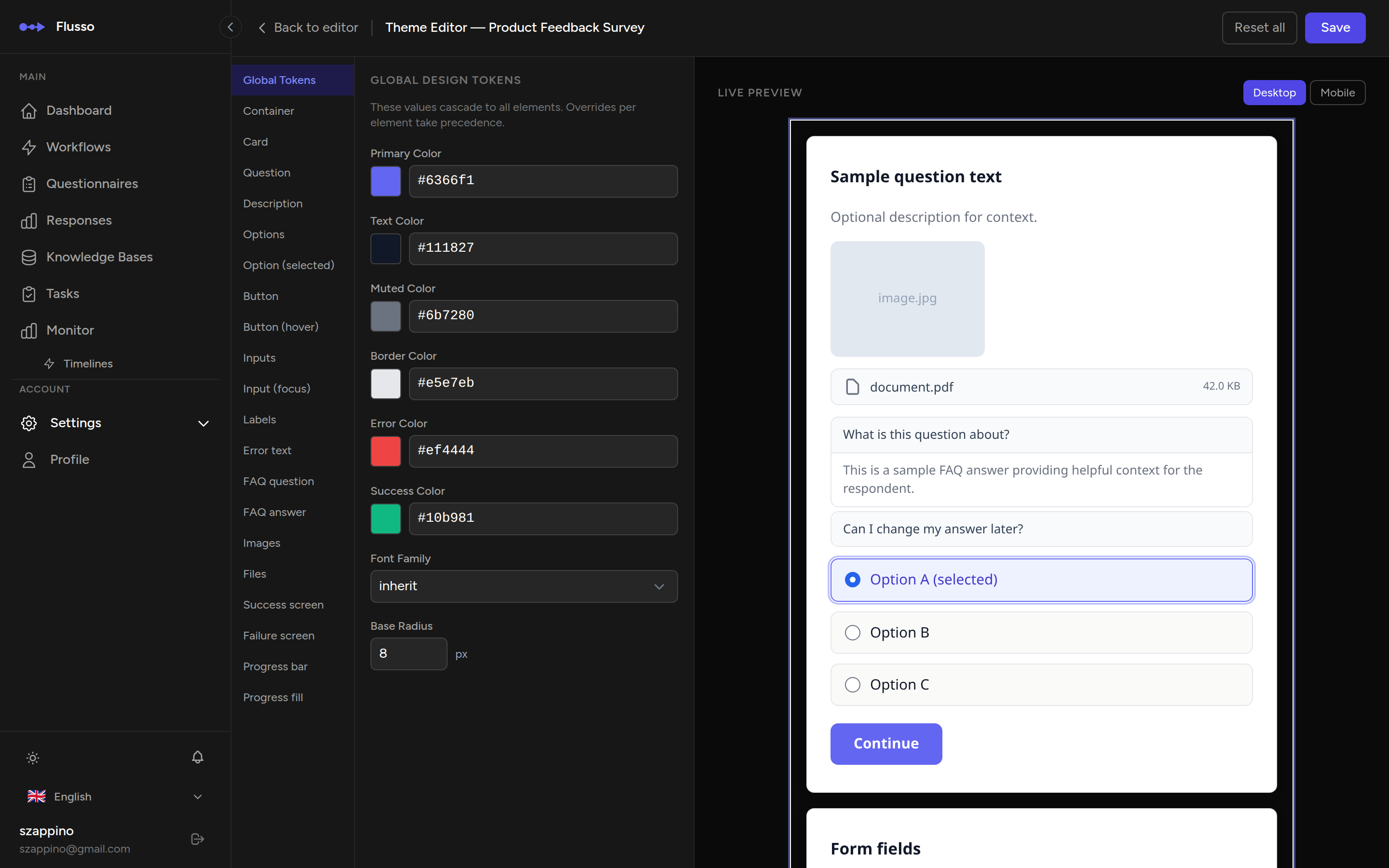
5.2 Theme Editor
The Theme Editor lets you customise the visual appearance of your questionnaire's web embed. You can adjust global design tokens (colours, typography, border radius), style individual elements (cards, buttons, inputs, progress bar, completion screens), and write custom CSS — all with a live preview that updates as you make changes.
Opening the Theme Editor
-
Open a questionnaire in the editor Navigate to Questionnaires in the sidebar and click the questionnaire you want to style.
-
Click the "Theme" button In the editor top bar, click Theme. The Theme Editor opens in a dedicated page with a three-panel layout.
Interface Overview
The Theme Editor is organised into three panels side by side:
| Panel | Position | Purpose |
|---|---|---|
| Element Selector | Left sidebar | Lists every styleable element as a tab. Click a tab to load its properties in the centre panel. |
| Property Controls | Centre | Shows the CSS properties for the selected element. Colour fields use a colour picker; other values use text inputs. |
| Live Preview | Right | Renders a realistic questionnaire preview that updates instantly as you change properties. Includes a desktop/mobile toggle. |
Global Design Tokens
The Global Tokens tab (the first element in the sidebar) defines design tokens that cascade to all other elements. Changing a token here updates every element that inherits it.
| Token | Default | Description |
|---|---|---|
| primary_color | #6366f1 (indigo) |
Accent colour used for buttons, selected options, progress fill, and interactive highlights throughout the questionnaire. |
| surface_color | White | Background colour for cards and the main container. |
| text_color | Dark grey | Primary text colour for questions, descriptions, labels, and body copy. |
| border_radius | 8px |
Global corner rounding applied to cards, buttons, inputs, and option chips. |
| font_family | System default | Typeface used across the entire questionnaire. |
| font_size | 16px |
Base font size. Other elements scale relative to this value. |
Element Styling
Below the Global Tokens tab, the sidebar lists every styleable element. Click any tab to load its CSS properties in the centre panel.
| Element Tab | What It Styles |
|---|---|
| Container | The outermost wrapper of the questionnaire embed. |
| Card | The question card that holds each step's content. |
| Question | The question text heading. |
| Description | The descriptive text displayed below the question. |
| Options | Answer option buttons in their default (unselected) state. |
| Option (selected) | Answer option buttons when the respondent has selected them. |
| Button | The submit / next button in its default state. |
| Button (hover) | The submit / next button when hovered. |
| Inputs | Text inputs and textareas for free-text and validated-text answers. |
| Input (focus) | Text inputs and textareas when focused. |
| Labels | Field labels above inputs. |
| Error text | Validation error messages shown below inputs. |
| FAQ question | The clickable question text in the FAQ accordion. |
| FAQ answer | The expanded answer text in the FAQ accordion. |
| Images | Image attachments displayed in the question gallery. |
| Files | Non-image file attachment cards (PDF, DOC, etc.). |
| Success screen | The completion screen shown when a session ends with a success status. |
| Failure screen | The completion screen shown when a session ends with a failure status. |
| Progress bar | The background track of the progress indicator. |
| Progress fill | The filled portion of the progress indicator that advances as the respondent progresses. |
Per-Element CSS Properties
When you select an element tab, the centre panel displays the CSS properties available for that element. The controls adapt to the property type:
- Colour fields — use a colour picker. Click the swatch to open the picker, or type a hex/RGB value directly.
- Size and spacing fields — text inputs that accept CSS values (e.g.
12px,1rem,0.5em). - Font and text fields — text inputs for font families, font weights, and other typographic values.
Changes take effect immediately in the live preview on the right. Properties left empty inherit from the global tokens or browser defaults.
Advanced: Custom CSS
At the bottom of the property controls panel, a collapsible Advanced — Raw CSS section provides a code editor where you can write custom CSS rules scoped to the questionnaire. Use this for styling that goes beyond what the property controls offer — animations, media queries, pseudo-elements, or complex selectors.
| Constraint | Details |
|---|---|
| Maximum length | 10,000 characters. |
| Scoping | All rules are automatically scoped to the questionnaire container — they will not leak into the host page. |
| Sanitisation | Unsafe patterns (expression(), javascript:, @import) are stripped on save. |
expression(), javascript: URLs, and @import rules.
This prevents potential security issues in the embedded questionnaire.
Preview
The right panel shows a live preview of the questionnaire as respondents will see it. The preview updates in real time as you modify properties or tokens.
- Desktop preview — shows the questionnaire at full width (default view).
- Mobile preview — constrains the preview to a narrow mobile viewport so you can check the responsive layout.
Toggle between desktop and mobile using the device icons at the top of the preview panel.
Saving & Resetting
| Action | Description |
|---|---|
| Save | Persists all theme changes (tokens, element properties, and custom CSS). The saved theme is applied immediately to the live web embed. |
| Reset Element | Resets the currently selected element's properties back to their defaults. Other elements are not affected. |
| Reset All | Resets the entire theme — all tokens, all element properties, and custom CSS — back to factory defaults. A confirmation modal appears before the reset is applied. |
| Back | Returns to the questionnaire graph editor. Unsaved changes are discarded. |